. To return to the prior view, click
the "Close" arrow in the upper left.
. To return to the prior view, click
the "Close" arrow in the upper left. 
Contents of page/chapter:
+Default Plot
+Plot Format: A First Look
+Plot Navigation
+Plot Linking
+Changing What is Plotted
+Plotting Manipulated Columns
+Restricting What is Plotted
+Overplotting
+Examples
To obtain a full-screen view of your plot, click on the expand icon in
the upper right of the window pane when your mouse is in the window:
. To return to the prior view, click
the "Close" arrow in the upper left.
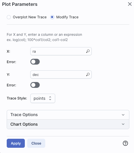
The plotting tool, by default, starts with RA and Dec plotted if it can find RA and Dec in the catalog. Note that it does so following astronomical convention -- RA increases to the left. If the catalog does not have RA and Dec, it plots the first two numerical columns it finds.
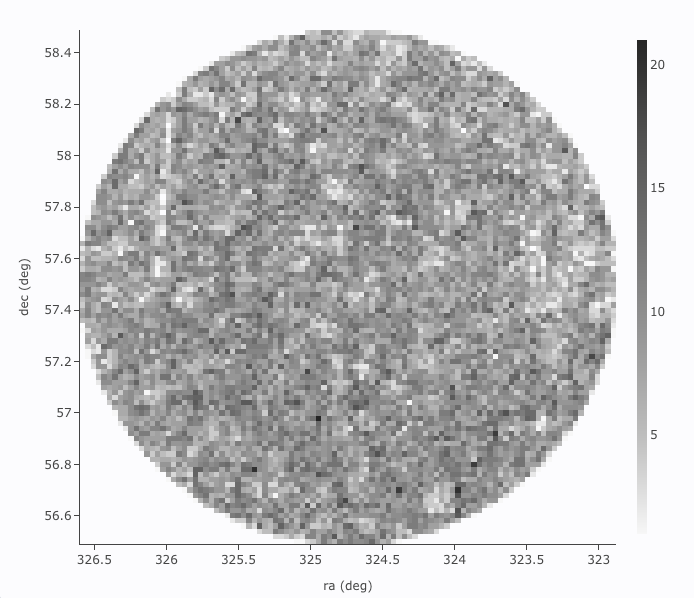
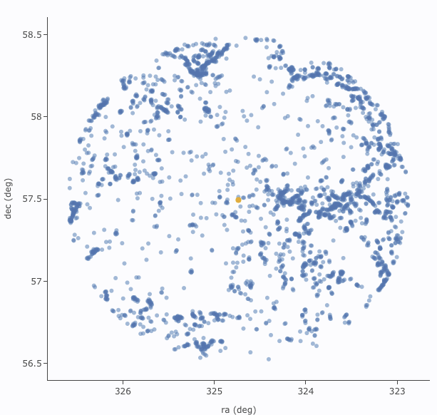
The difference between them is that, for larger catalogs (left), the plot is binned -- the shades of grey correspond to how many points are encompassed in each 'cell', with the density scale given on the right hand side of the plot. In the context of this tool, this is called a heatmap. For smaller catalogs (right), each individual point is shown as a blue dot. In the context of this tool, this is called a scatter plot. Note that even when individual points are shown, where the points overlap, the color is darker.
In either case, letting your mouse hover over a point tells you the
values of the point under your cursor, and (if binned) how many points
are represented:
 for binned
plots, and
for binned
plots, and
 for just one point.
 Clicking (in an unbinned
plot) highlights that point, and it stays highlighted, though you
must keep your mouse on the point in order to see the information
about it.
Clicking (in an unbinned
plot) highlights that point, and it stays highlighted, though you
must keep your mouse on the point in order to see the information
about it.
The reason the tool makes a heatmap for large catalogs is to more fairly represent the point density -- and to make the plotting faster. In these cases, though, it will not give you the option to overplot errors (see below). If you have a heatmap and want a scatter plot, you need to filter or otherwise restrict the catalog to have fewer points (see below). You can change the bin size and shading via the plot options pop-up (more on this below).
 which we now describe.
 Plot mode
 Zoom mode
 .
.
 Pan mode
.
Pan mode
.
 Select mode
 The checkmark means
"select" and the funnel means "filter." The difference is that
filtering (temporarily) limits what is shown in the plot, catalog, and
image (see general information on
filters), and selecting just highlights the points enclosed within
your selection. To cancel either one, click on cancel filters
The checkmark means
"select" and the funnel means "filter." The difference is that
filtering (temporarily) limits what is shown in the plot, catalog, and
image (see general information on
filters), and selecting just highlights the points enclosed within
your selection. To cancel either one, click on cancel filters  or cancel selection
  .
.
Re-scale plot ⚠ Tips and Troubleshooting: Did you accidently zoom in the plot with your magic mouse or touchpad? Click on this icon to reset the plot.
 Save
plot
Save
plot
 Undo
Undo
 Filter from plot
 Configure plot
Expand plot
 Help
Help
.
Configuration options then appear; the options are a little different
depending on whether the points are binned or not. This section
describes how to change what is plotted, i.e., the "Modify Trace"
option at the top of both of these pop-ups. The overplotting option (and, for that matter, adding plots) are covered in more detail below.
 | This is the configuration window for a binned (a.k.a. heatmap and/or greyscale) plot. By default, the "chart options" may be hidden; to reveal them, click on the name "Chart Options" or the disclosure arrow on the right. To hide them again, click on the disclosure arrow on the right. |
 | 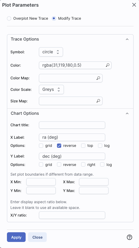 | The configuration window for a plot that shows individual points, once fully extended, is much longer (and scrollable), and so is shown here in two parts. Both the "Trace Options" and "Chart Options" may be hidden by default; to reveal them, click on the name or the disclosure arrow on the right. To hide them again, click on the disclosure arrow on the right. |
Click on the black triangle to reveal additional options.
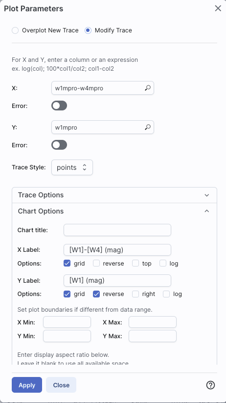
In both of the examples above, RA is plotted on the x-axis. It has pulled the column name for the label; in this table, the column is "ra" rather than "RA", and it is case-sensitive. It has copied over the units ("deg") from the catalog, and plotted the x-axis increasing to the left as per astronomical convention. You can change what column is plotted, and whether or not errors are shown. Under "Chart Options", you can specify:
By default, the boundaries of the plot are set to encompass the full data range. Here you can change the boundaries to specific numbers. (This can also be set via filtering from the plot; see below.)
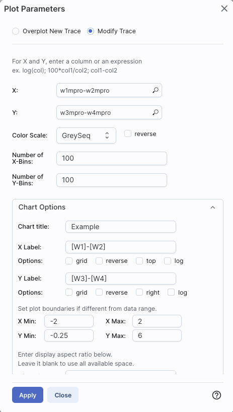
You can enter simple mathematical relations in these boxes too, such as (for a WISE catalog) "w1mpro-w4mpro" to put [W1]-[W4] on one axis. Supported operators:
Click "Apply" to apply, and "Close" to return to the plot without making changes. (For the latter, you can also click the 'x' in the upper right.)
Under "Trace Style," you can control whether the points are shown as individual points, connected points, or just lines connecting the points.
Under Trace Options, you have many choices.
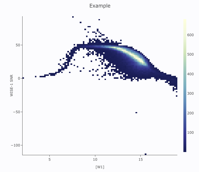
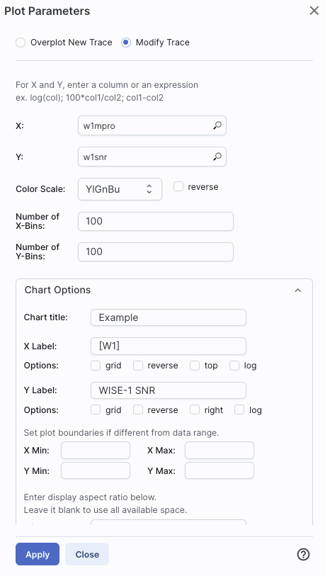
Example: Load either a smaller WISE catalog, or the same large WISE catalog, but filter it down such that w1snr, w2snr, and w3snr are all greater than 10, which limits the number of points to be <5,000. Plot w1snr vs. w1mpro. It shows the points individually. Change the labels. Change the point color map to scale with w2mpro (WISE-2 profile fitted magnitude). Change the point size map to scale with w4snr (WISE-4 signal-to-noise). Obtain this plot:

For example, if you have loaded a WISE catalog, you can plot [W1]-[W2]
vs. [W3]-[W4]. In terms of the names of the columns in the database,
this is w1mpro-w2mpro vs. w3mpro-w4mpro. 
|
|
If you have few enough points that the plot is not binned, you can add
errors that you calculate. Here, the expression for the
x-axis errors is sqrt(power(w1sigmpro,2)+power(w2sigmpro,2)) and for
the y-axis errors, it is sqrt(power(w3sigmpro,2)+power(w4sigmpro,2))
-- that is, the errors for the individual photometric points added in
quadrature. 
|

|
You can filter the catalog from the table itself (discussed in another section).
You can set axis limits on the plot itself from the plot options pop-up (discussed above).
However, and perhaps more powerfully, you can set limits from the plot
itself using a rubber band zoom. Click on the select icon in the plot
Then, click and drag
in a sub-region of the plot. New icons appear: If you click on the
funnel icon, only those data points that pass the filter are shown in
the plot, in the table, and/or overlaid on the image(s). (This is the
behavior of 'filter', as opposed to 'select'; the former restricts
what is shown, the latter just highlights the points.) For more on
filters, see the filtering discussion in
the tables section.
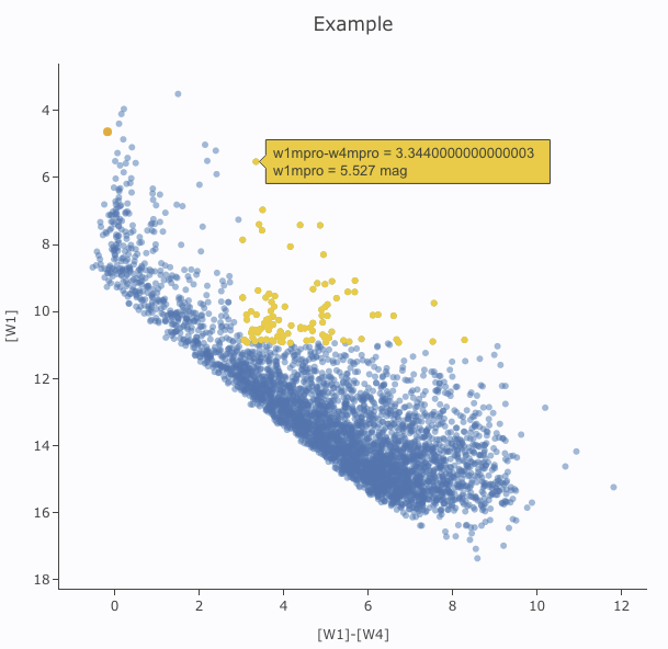
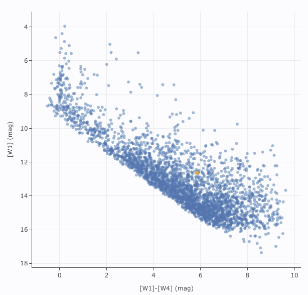
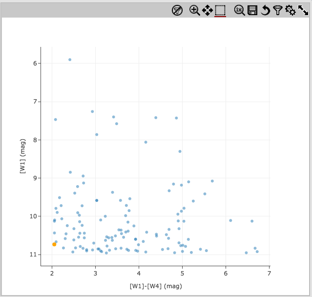
Example: Obtain a WISE catalog of a star-forming
region, say IC1396. Filter down the catalog to only have detections at
all four WISE bands. (Limits have undefined errors, so ask the catalog
to filter down such that w1sigmpro>0, w2sigmpro>0,
w3sigmpro>0, and w4sigmpro>0). Plot w1mpro-w4mpro on the x-axis,
and w1mpro on the y-axis. Reverse the y-axis to put bright objects at
the top. Click and drag in the plot to select the bright and red
objects, and filter them down to get a subset of bright and red
sources. For clarity, the screenshot here has the sources selected,
not filtered.
 They are "Overplot New Trace" and "Modify Trace." Modifying traces
(plots) has been covered above; in this section, we will cover
overplotting. This is sometimes called "multi-trace," meaning that
more than one thing is plotted.
They are "Overplot New Trace" and "Modify Trace." Modifying traces
(plots) has been covered above; in this section, we will cover
overplotting. This is sometimes called "multi-trace," meaning that
more than one thing is plotted.
When you select "Overplot New Trace," you get a new interface that is
very similar to the original interface where you selected what to
plot:
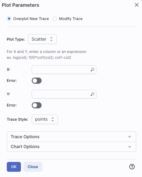
As before, you need to :

|
The best way to explain how to use this feature is probably via an
example. I have a plot of [W1] vs. [W1-W4]. Now I am going to add on
top of it a plot of [W2] vs. [W1-W4]. Click on the gears to bring up
the pop-up. Select "Overplot New Trace." Enter "w1mpro-w4mpro" for x
and "w2mpro" for y. Expand "Chart Options." Note that it has preserved
the overall chart title from before, but has erased the X and Y labels
(and lost the reversal of the y axis) because the overplot could
literally be anything, and need not be the same columns or even the
same units as what is already plotted. Type them in again. Here is the
configuration window right before clicking "ok", and the resultant
plot. 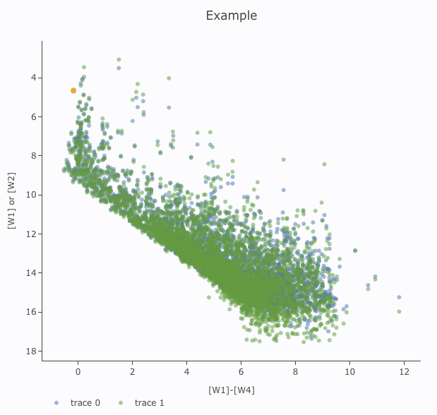
|

|
After you add the overplot, if you click on the gears again, note that
the choices at the top of the window have changed. You can add another
overplotted trace, modify a trace, or remove the active trace. Each
trace that you add is a new 'layer' on the plot. The drop-down menu
near the top of the window controls which trace is 'active' for
setting the x, y, errors, trace style, name, symbol, color, etc.
there is now a drop-down menu at the top of the plot: There is a
legend on the plot specifying which color corresponds to which trace.
In this example, the plot above has appeared using a blue and green
color scheme, which may be too hard to differentiate. To change the
new points' color, click on the gears, ensure "Modify Trace" is
selected, select "trace 1" (as opposed to "trace 0", the first one you
loaded), go down and expand the "Trace Options" and pick a different
color. You can also change the legend name from "Trace 1" to, in this
case, "[W2]". Click "apply" to apply the changes to the plot. Note
that once you change the trace name, the relevant drop-down menus in
the pop-up window and the legends on the plot update accordingly.
|
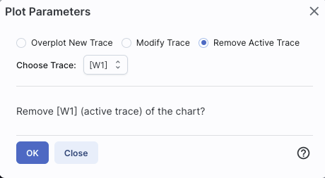
Note that the pop-up spawned by clicking the gears now has an additional
option at the top: "Add New Chart", "Overplot New Trace", "Modify
Trace", and "Remove Active Trace." From here, you can modify a trace
you have already plotted (as described above), overplot another trace
(also as described above), or remove the selected trace:
⚠ Tips and Troubleshooting
and try
again.
For this example, we are trying to find young stars in a star-forming region. We are searching in the WISE AllWISE catalog. Stars without circumstellar dust should be at a variety of W1 brightnesses, but all have [W1]-[W4]~0. Background galaxies should be faint and red. Stars with circumstellar dust (e.g., young stars) should be bright and red. Here, we will make a plot, identify a bright and red object in the plot.
to add filters to the top of each column in the
catalog. In this catalog, limits have null errors. To limit the
catalog to just those with high-quality detections, in the top of the
"w1sigmpro" (WISE-1 profile fittted magnitude error) column, type
">0" (without the quotes). Repeat for w2sigmpro, w3sigmpro, and
w4sigmpro. At the top of the "w1snr" (WISE-1 signal-to-noise ratio)
column, type ">10" (without the quotes). Repeat for w2snr, w3snr,
and w4snr. After this process, you should have ~3,000 sources, enough
fewer that the plot now has individual blue points (it is no longer a
heatmap). Now the individual sources are also all
shown on the image.
icon in the
upper left of the plot window to change what is plotted.
 ). Click and drag from corner given
approximately by (2,6) to (7,11).
). Click and drag from corner given
approximately by (2,6) to (7,11).
From the Catalog Search Tool, select the "AllWISE Multiepoch Photometry Table." Search on RR Lyr, and ask it for a radius of only 3 arcsec. It comes back with 49 epochs. The default plot looks a little odd because all the individual epochs are at the same position (RA and Dec).
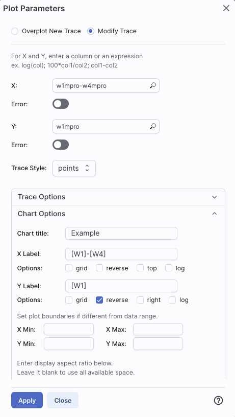
Click on the gears to change what is plotted. For the x-axis: Ask it
to plot mjd. For the y-axis, ask it to plot w1mpro_ep, and use
w1sigmpro_ep for
the errors. Reverse the y-axis to get bright objects at the top. There
are two epochs of data obtained for this source, one near MJD~55,300
and one near 55,500. Click and drag in the plot to select one of the
two epochs and filter via the icon at the top of the plot.
Obtain a plot something like this, which shows the error
bars for each point.
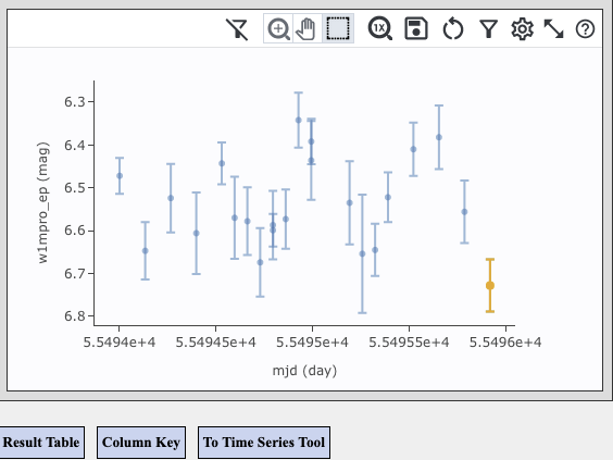
You can send the light curve so obtained to the Time Series Tool for further analysis by clicking on the "To Time Series Tool" button below the plot.
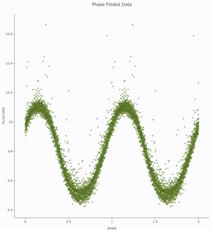
Still More Plots
Here are several more examples of plots made with IRSA tools.
Phase-folded light curve from K2 data:
Plot on the sky of stars where the color of the point is scaled to
brightness in WISE-4:

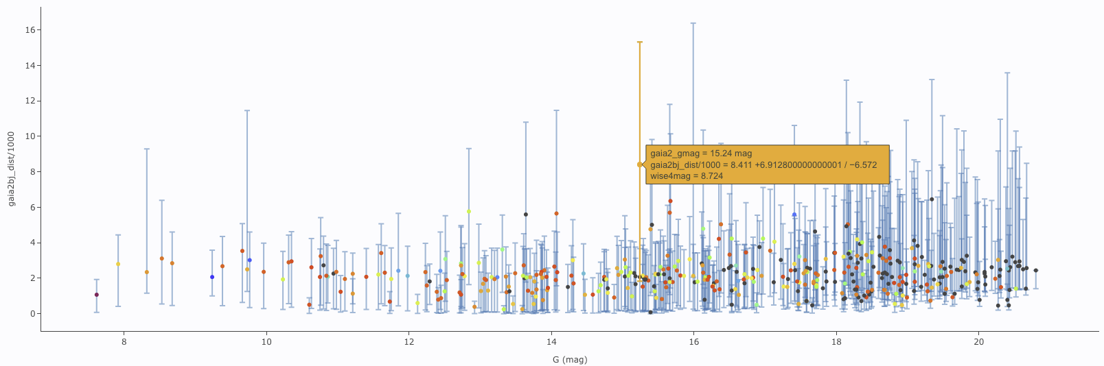
Gaia distance (in kpc, from Bailer-Jones et al. 2018), with asymmetric
errors, as a function of Gaia G magnitude, with colors of the point
scaled to brightness in WISE-4:
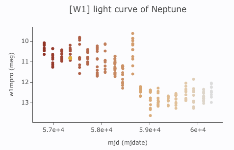
[W1] light curve of Neptune over
several years, with colors of the point scaled to heliocentric
distance:
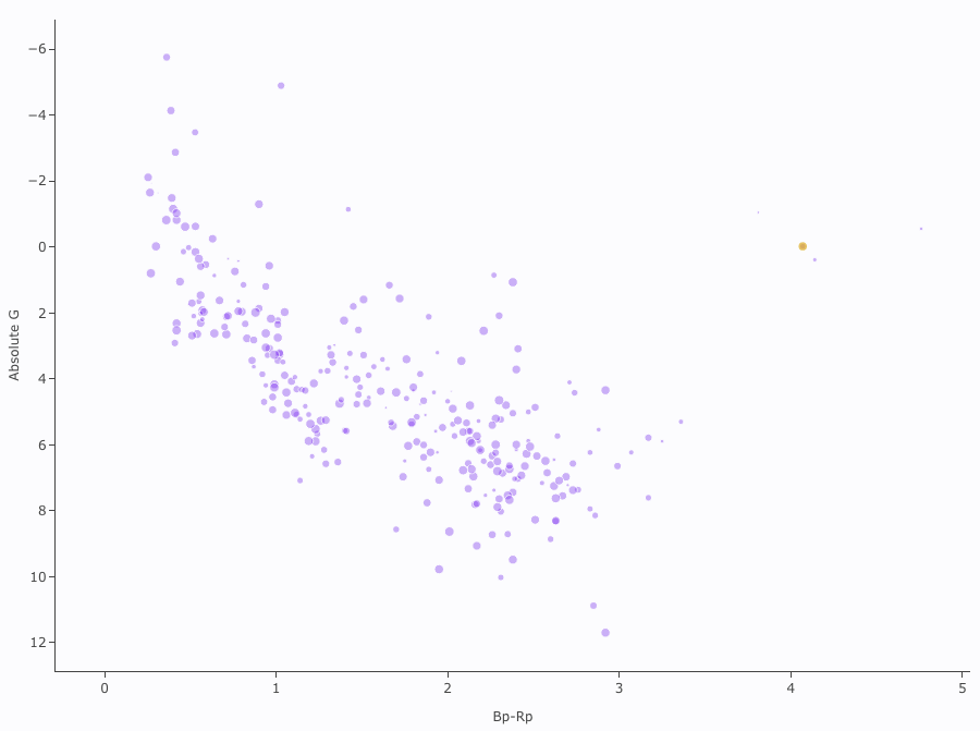
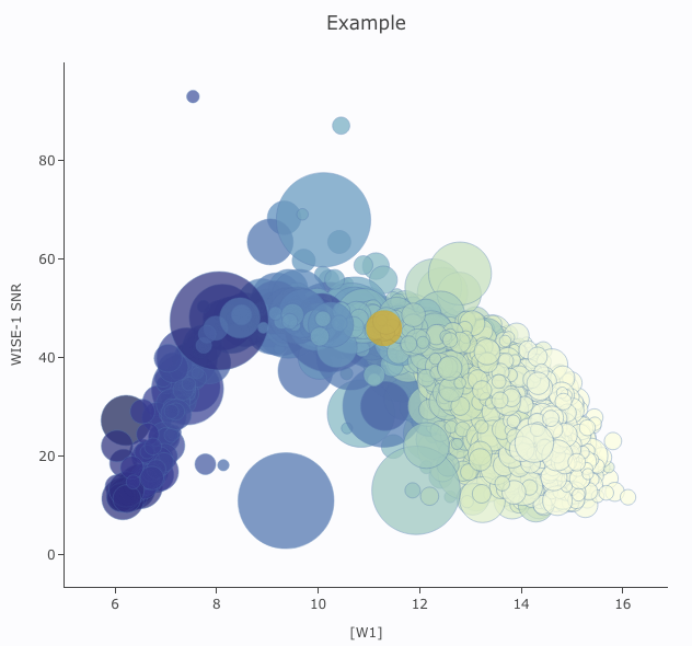
Absolute Gaia color-magnitude diagram of candidate members of a
star-forming region (note some background giants still in the list),
where point size is scaled by WISE-4 brightness: