Contents of page/chapter:
+Plotting Spectra
+Redshifting Spectra
+Viewing as a Table
+Combining Spectra
+Potential confusion: Why is it reloading?
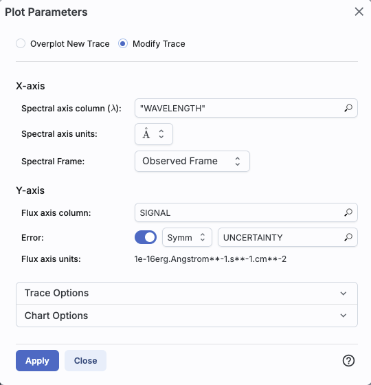
Changing what is plotted by clicking on the gears is similar to, but not quite the same as, the generic case. Now, because it knows it is plotting a spectrum, you can select the x- and y-axis columns and units from a pre-defined set of choices in the drop-down menus, where it will convert the units when necessary.
| | In this example, the tool has
identified the wavelength axis as 'WAVELENGTH', understood the units
(Angstroms), and is showing them in the observed
reference frame. It has identified the flux axis column as 'SIGNAL' and
the corresponding error as 'UNCERTAINTY', and understood the units as 1e-16
erg/Angstroms/s/cm^2.
From the drop-down menus, you can choose to convert the wavelength to
Angstroms, nanometers, microns, millimeters, centimeters, or meters.
It is plotting the spectrum as connected points,
with error bars. |
You don't have as much flexibility in these plots as you do for plots in general, but the options you do have are highly customized to spectra, such as redshifts. See the next section!


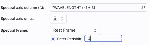
Click 'Apply' to implement these changes in the plot. The axis labels on the plot correspondingly change.
To change back to the data as observed, simply pick "Observed Frame" from the drop-down menu.

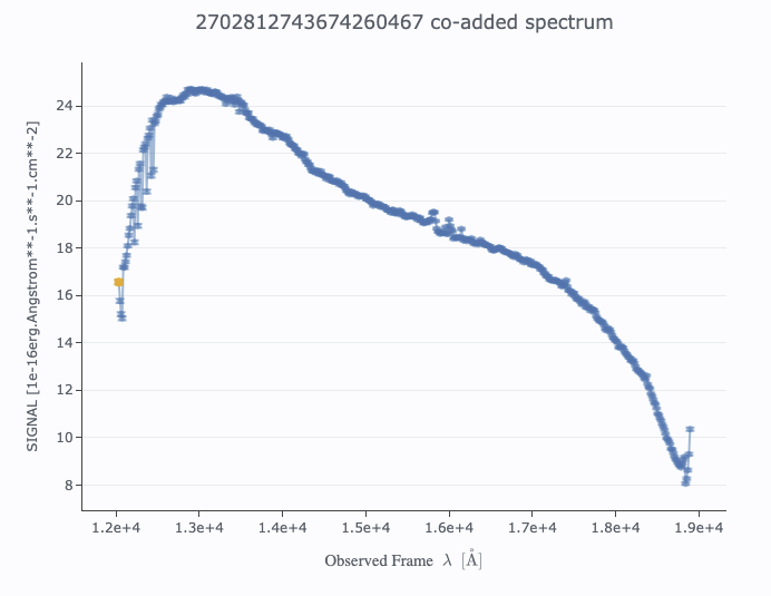
⚠ Tips and Troubleshooting: Since several of the values in most Euclid spectra are zero to indicate "no data", you probably want to impose a "> 0" filter on the "SIGNAL" column right away to make the plot look better. HOWEVER, this filter will only 'persist' (stick around after you navigate away from the spectrum and return to it later) if you pin the spectrum and filter on the pinned spectrum's table.
When you have more than one plot pinned, this icon may appear at the
top of the plot pane:  This means "Combine Chart".
This option only appears if you have pinned at least two plots, and it will only let you combine plots if it recognizes that you have spectra loaded.
To start this process, click to select the first chart you want to
combine, then click on the "combine chart" icon. You get a pop-up
like this:
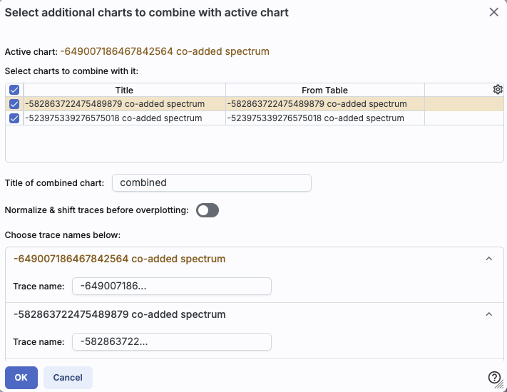
All of the remaining pinned charts
that can be combined appear as a list at the top. Once you select them
via the tickboxes on the far left of the list (the first one in the
list is selected here), they appear as options on the bottom of the
pop-up window. For this example, I am combining three Euclid spectra.
Continuing through this pop-up, you can choose to set the title of the new plot you are about to create -- the default is "combined".
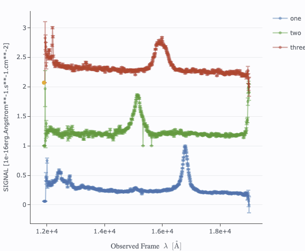
The next choice is "Normalize & shift traces before overplotting."
Here is what this is and why it matters. If you are combining spectra
that are nearly all the same brightness, the spectra will be plotted
on top of each other. Sometimes that is what you want, and sometimes
that is not. If you click on the "Normalize & shift" option, you
have an additional choice:

This is telling you how it is
going to stack the spectra on the final plot. See below for examples
with and without these offsets. You can adjust the amplitude of the
offset by changing the size of the padding, as shown.
Finally, you can change the name of the trace as displayed on the plot (and in the pull-down menus in the tool) for each of the spectra you are combining.
Click "OK" to actually make the new plot.
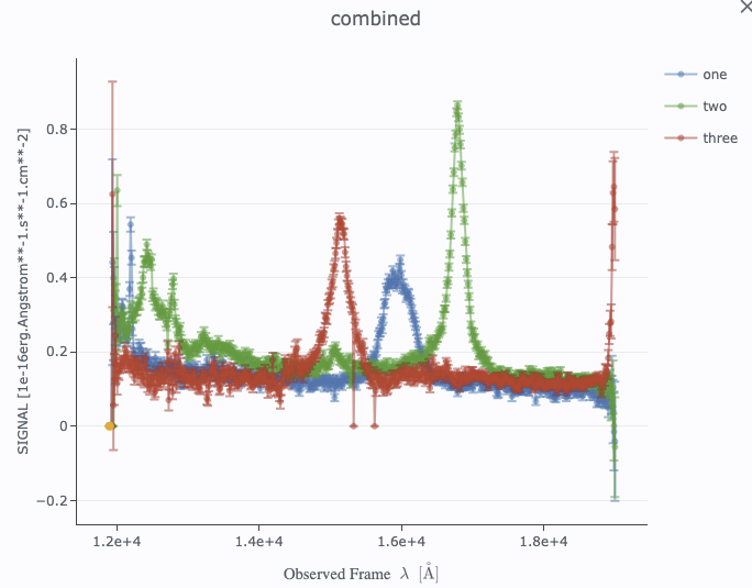
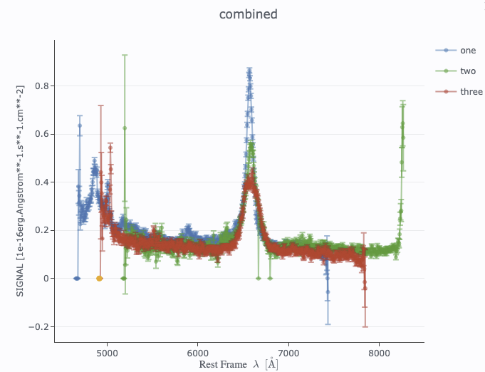
Here are some examples of combined spectra, both observed and rest
frame. All are useful, but in different contexts.

Note that after you combine a plot, there is a new drop-down at the top of the plot that controls which trace is in the 'foreground' for changing plot parameters or selecting points, but you can also simply click on points in the plot to bring that trace to the foreground.
⚠ Tips and Troubleshooting
After a search, you have a list of sources on the left and spectra on the right, which change based on what you have selected on the left.
When you view a spectrum, you might find that there are some values in the spectrum that you'd prefer that the tool not plot, such as zero values. You can view the spectrum as a table, and use the properties of the table to impose filters on the spectrum to remove the outliers, and then the plot looks better. So far, so good.
If you then click on a different row on the left, a new spectrum appears. You might impose the same filter there. But then, you want to go back to the first spectrum to compare the spectra. You do that ... and the filter you imposed is gone!
Each time you change what you've clicked on the left, it reloads
the entire data product on the right. So, if you impose a filter
on the plot or the data table, that filter is removed when you go back
and reload the data product. In order for the filter to "stick", you
need to first pin the spectrum ( ), and then filter the table associated
with that pinned spectrum. Then the filter persists even if you click
away from that spectrum and then come back to it.
), and then filter the table associated
with that pinned spectrum. Then the filter persists even if you click
away from that spectrum and then come back to it.
When you pin the spectrum, it also makes viewing the spectrum faster. Every time you reload the data product, the tool is re-pulling the spectrum out of a large file of many spectra. By pinning the spectrum, you're temporarily saving the data in your browser, so it works faster all subsequent times you want to view the same spectrum.