IRAC High Precision Photometry
The IRAC detectors have a known nonlinearity such that a linear increase in the number of incoming photons does not lead to a linear increase in the flux measured on the detectors. The pipeline corrects for this nonlinearity, however this correction is only good to 1%. High precision photometry studies which want to use the gain map taken at one flux level to correct science data taken potentially at another flux level are sensitive to a “residual nonlinearity”. We document the existence of this residual nonlinearity, and show that as long as we observations stay between 1,000 and 15,000 DN (in ch2), it does not effect flux as a function of position on the pixel.
In both sides of Figure 1 we see a nonlinear relation between the amount of input counts(DN) and the measured Flux. These are two different datasets which were designed to look at this relation by changing either the exposure time on the same star using IERs (a) or changing the exposure times on a set of stars using AORs (b). Both datasets have already been corrected by the pipeline nonlinearity. Anything not a flat line in these plots is a residual nonlinearity.
However, the residual nonlinearity doesn’t appear to mean that the gain map (pmap) has a different shape as a function of gain. The current best way we have thought of to show this is a plot of peak pixels in DN vs. distance from the center of the sweet spot (Dsweet; Figure 2). The DN in the peak pixel decreases, as expected, with larger distance from the center of the sweet spot. The shape of this falloff is not symmetric around the center and therefore leads to an envelope of points in Figure 2. Each color in this plot represents a different star with differing peak pixel DN levels, where each star has been normalized to the center of the sweet spot. The fact that these envelopes are all of the same shape and overlap on the normalized plot, indicates that the pmap does not have a different shape depending on DN. Therefore, residual nonlinearity does exist, but is not changing the shape of the pmap.
This probably works because all stars tested in Figure 2 have DN in the range of 2K to 15K where the nonlinearity is ‘linear'. The nonlinearity slope doesn’t change for this range of DN (Figure 1). That slope is already incorporated into the pmap because the pmap star has source DN which vary significantly as a function of position, so the pmap is made with some slope of nonlinearity inherent in it. This makes the shape of the gain map the same for all DN in the “good” range.
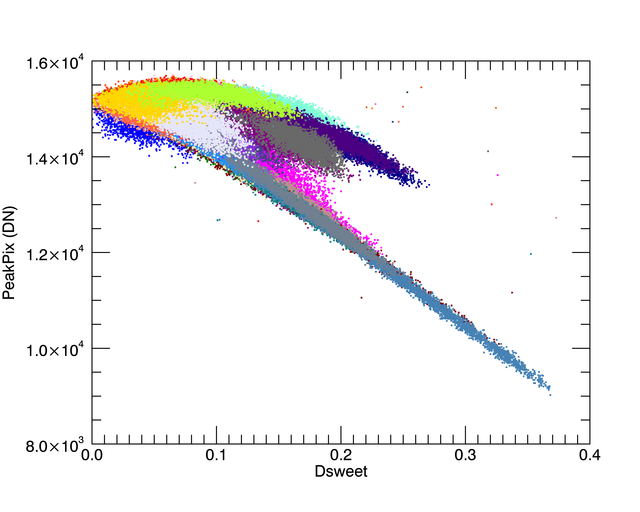
Proof that this is a good plot to use to understand the effect of the residual nonlinearity comes in the second part of Figure 2. To see this best, I have plotted only the pmap 3K observations and HD158460 28K observations. The observations at 28K have a different slope to the top envelope that we don’t see in any of the other observations in the more linear regime.
Implications:
- Gain map can be used to correct photometry in the good DN range.
- Pixel level decorrelation (PLD) can be used with the gain map dataset coefficients to correct other photometry in the good DN range.
- It *should* be ok to add other datasets to the gain map dataset to fill in coverage
- Distance from the sweet spot should be used carefully in other analysis tasks.
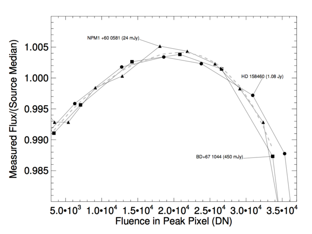
 This plot was made from linearity corrected data taken with IERs to change the amount of integrated fluence for 3 different stars. Special darks were taken with the same observing parameters in order to correct the IERs. The slope appears to be constant below~18K DN. b) Same as a) only over a different range, and with logx. This data is from the nonlinearity special calibration. There are multiple different stars taken with multiple different frame times to fill in the Peak Pixel DN phase space shown in left hand side. The gray dashed line is from Figure 1. Each cloud has its frame time and ‘F’ or ’S’ for full or subarray plotted at the loation of the mean of the cloud. A single star maintains its color throughout the plot.")
Figure 1: Flux vs. Fluence. a) This plot was made from linearity corrected data taken with IERs to change the amount of integrated fluence for 3 different stars. Special darks were taken with the same observing parameters in order to correct the IERs. The slope appears to be constant below~18K DN. b) Same as a) only over a different range, and with logx. This data is from the nonlinearity special calibration. There are multiple different stars taken with multiple different frame times to fill in the Peak Pixel DN phase space shown in left hand side. The gray dashed line is from Figure 1. Each cloud has its frame time and ‘F’ or ’S’ for full or subarray plotted at the loation of the mean of the cloud. A single star maintains its color throughout the plot.
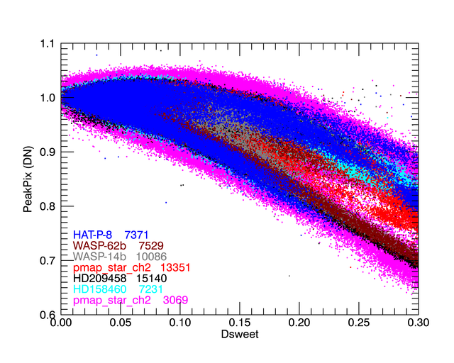

Figure 2: Peak Pixel value in DN vs. Distance from the sweet spot. Sweet spot is defined here to be [15.12, 15.1]. These stars are all observed with multiple snapshots, and include the gain map calibration star itself taken with two different frame times. The second plot shows the different slope when using a 28K source.

Figure 3: The gain map. This is the 2014 09 04 gain map. Gain is not symmetric around the center of the sweet spot.
. Also shown are the positions of the centroids in those AORs.")
Appendix plots: It is interesting to see what individual AORs look like on the peakpixDN vs. Distance from sweet spot plot. These are AORs of HD209458 (black in Figure 2 above). Also shown are the positions of the centroids in those AORs.